For my Question 6 of my evaluation I have decided to present it as a prezi, The link is below.
http://prezi.com/0acdmke6l1xz/?utm_campaign=share&utm_medium=copy
Showing posts with label analysis of film openings. Show all posts
Showing posts with label analysis of film openings. Show all posts
Friday, 25 March 2016

Tuesday, 15 March 2016
Evaluation Question 4
We have decided to go for a 15+ BBFC rating as it enables us to include all the necessary content we need to make our film effective and it allows the biggest range of audience suitable, to watch the movie providing them not to be offended or distressed from the scenes. I have retrieved the following criteria from the British Board of Film Classification Website:
I believe that we will need to represent the themes and ideologies which our target audience can potentially relate to. For example with regards to social class, our film explores both working and middle class lives which will allow people from both demographic social groups to internally relate to this. We have placed emphasis on this through the use of many factors. For example we chose specific locations to add emphasis in situations such as the houses used at the start of each introduction of the character to demonstrate the contrast between the two lives. We also used a tunnel which was full of graffiti to try signify the working class element of the film. We also used nice parks and walkways to help express the extent of the older mans middle class lifestyle. In terms of props and costumes, we followed the stereotypes closely with regards to social class. For example Kieran was portrayed in an Adidas tracksuit which signified clearly the socio-economic background in which he belonged to. Also with regards to Mike's outfit he was seen as being dressed in nice, smart clothes which connotes a level of affluence.
In terms of mainstream audiences in comparison to the niche audience of this film there are major differences. Big 6 companies such as Working title focus their films to the mainstream audiences through widening the audience appeal by catering for the needs of as many people as possible. This done through having a lower BBFC rating ,allowing it to seem more appropriate, than most indies. Working title also follow the stereotypes of Britain which allows international consumers to be enticed into watching the film. The stereotypes include: Caucasian, middle class, southern english and a quiet little village.
I believe that this film, due to the nature of the film providing a philosophical outlook we
believe that this film will cater for intellectually inclined people across the country and entice
those who want to increase their own understanding and knowledge about working life in general.
What might I see in a 15 rated film or video?
Any of the following:
- strong violence
- frequent strong language (e.g. 'f***').
- portrayals of sexual activity
- strong verbal references to sex
- sexual nudity
- brief scenes of sexual violence or verbal references to sexual violence
- discriminatory language or behaviour
- drug taking

The above criteria is what we believe our film falls into allowing there to be clear distinction to who can watch this movie or not.
In terms of our primary target audience, we have decided to go for the age range of about 15-30. Usually a film's central protagonists reflect that age of the primary audience which in our case is a 19 year old male and an older 40-50 year old male. After intense research into target audience within British cinema on the bfi.org.uk website I found that in 2014, 15-24 year olds made up the largest proportion of the
UK cinema audience, at 31%. This will therefore enable our film to cater for as big of an audience as possible allowing our film to be more successful as a result.
The film is more likely to be intended for a male audience due too the gender of the protagonists, however with the added bits in regarding relationships and emotional attachment it might also cater for a female audience within this age category. The audience will be expecting from the nature of the film a hard hitting moral providing film which creates a sense of understanding of the working class societies embedded in todays Britain. The audience will be expecting an emotional rollercoaster which will hook them immensely to the film allowing them to truly explore the themes and ideas being represented.
The film is more likely to be intended for a male audience due too the gender of the protagonists, however with the added bits in regarding relationships and emotional attachment it might also cater for a female audience within this age category. The audience will be expecting from the nature of the film a hard hitting moral providing film which creates a sense of understanding of the working class societies embedded in todays Britain. The audience will be expecting an emotional rollercoaster which will hook them immensely to the film allowing them to truly explore the themes and ideas being represented.
In terms of our secondary target audience we are intending this film towards the older population of 30+ as we believe that many adults will enjoy watching our movie due to the adult and mature films it will present. Also I believe that within this group of people not all will want to watch our movie therefore we have made the decision in not marketing it directly to them as it would not be financially efficient.
Ethnically this film will contain a cast from a variety of backgrounds and cultures. Therefore this will cater for a range of culturally diverse people expanding the potential audience even further than intended.
We will market this film according to the primary target audience of 15-30 years olds. We will market this film through means of social media which is heavily used by people of this age group especially which will therefore stimulate a level of awareness of the film itself.
Also in terms of marketing I believe that already film fanatics will be suitable for the viewing,
therefore I believe that advertisements on T.V will be effective in increasing awareness of the film. In order to attract our potential viewers we will need tho use things such as trailers to entice the viewer. The use of reviews also allow people to make an opinion on your film once it is backed by someone else.
Also in terms of marketing I believe that already film fanatics will be suitable for the viewing,
therefore I believe that advertisements on T.V will be effective in increasing awareness of the film. In order to attract our potential viewers we will need tho use things such as trailers to entice the viewer. The use of reviews also allow people to make an opinion on your film once it is backed by someone else.
I believe that we will need to represent the themes and ideologies which our target audience can potentially relate to. For example with regards to social class, our film explores both working and middle class lives which will allow people from both demographic social groups to internally relate to this. We have placed emphasis on this through the use of many factors. For example we chose specific locations to add emphasis in situations such as the houses used at the start of each introduction of the character to demonstrate the contrast between the two lives. We also used a tunnel which was full of graffiti to try signify the working class element of the film. We also used nice parks and walkways to help express the extent of the older mans middle class lifestyle. In terms of props and costumes, we followed the stereotypes closely with regards to social class. For example Kieran was portrayed in an Adidas tracksuit which signified clearly the socio-economic background in which he belonged to. Also with regards to Mike's outfit he was seen as being dressed in nice, smart clothes which connotes a level of affluence.
In terms of mainstream audiences in comparison to the niche audience of this film there are major differences. Big 6 companies such as Working title focus their films to the mainstream audiences through widening the audience appeal by catering for the needs of as many people as possible. This done through having a lower BBFC rating ,allowing it to seem more appropriate, than most indies. Working title also follow the stereotypes of Britain which allows international consumers to be enticed into watching the film. The stereotypes include: Caucasian, middle class, southern english and a quiet little village.
I believe that this film, due to the nature of the film providing a philosophical outlook we
believe that this film will cater for intellectually inclined people across the country and entice
those who want to increase their own understanding and knowledge about working life in general.
Monday, 14 March 2016
Evaluation question 2
"How does your media product represent particular social groups?"
With regards to representation, our film and the budget of our film is very closely linked to the level of social groups being represented in our short film opening. As our film is of the social realist genre, we believe that to follow all the big companies such as universal with our representations and stereotypes then it wouldn't be as effective in portraying a true representation.
Kieran (Counter type)
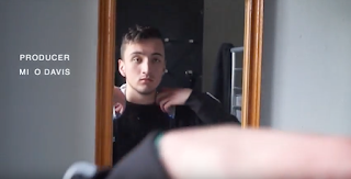 The second character to be introduced into the film opening is Kieran. After seeing the first few scenes involving this character, Kieran would be stereo typically regarded as working class, delinquent, criminal and a 'chav'. We have reinforced these stereotypes by using things such as props, costumes and locations associated with this specific character. The first signifier of Kieran being identified with this working class lifestyle is before you actually meet the character and see his house which is a stereotypical council flat which can be often associated with the working class segment of the population. Other signifiers included the props which we used to associate with Kieran. For example the fake drugs we used when Kieran wakes up signifies his level of criminal involvement which will allow the viewer to create a perception of a bad person. The use of Kieran's costume also adds to the stereotypical portrayal that the viewer will have of the character at the start of the opening. The tracksuit is a black Adidas originals tracksuit with is very often associated with gang culture and the working class lifestyle. However despite all the conventions and stereotypes regarding the UK's working class culture, which has been followed and reinforced, we believe that our character is actually a counter type of this negative image. As the viewer will see, in the last scene of the opening before the main title, Kieran actually goes out of his way too help the old man to come down from the bridge in which he is threatening to jump from. This random act of kindness fights and stereotypical assumptions of this character in the sense that he is not a self indulged and delinquent individual which he might be perceived to be.
Michael (Stereo type)

With regards to our other central protagonist, we believe that we have created a character in which follows the conventions and stereotypes of a middle to upper class male. These stereotypes are reinforced by many things so that the viewers get a universal understanding and perception of the character. These reinforcements include things such as the house which is in the first shot of the film. This house is the house in which our upper class protagonist lives. The house is of a big size and is made from nice aesthetically pleasing stone. This itself connotes a vast amount of wealth which helps show the viewer an insight into what the character is essentially about from the offset of the opening. Another reinforcing factor in which we have used is the use of the smart attire in which the character is wearing with a nice blazer and shoes etc. This also creates a sense that the character is wealthy and allows the viewer to understand this quickly.
Age
With regards to age I believe that our film represents an age between our intended primary target audience of 15 years to 30 years of age. This is because I believe as our characters fit within this age ,with the exception of mike being slightly older, it will allow the viewers to more easily internally relate to the film and the themes in which it explores such as poverty or even wealth.

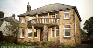 We believe that with regards to social class, our film represents both sides of the spectrum, poor and wealthy. The poor side is represented through Kieran and his delinquent and criminal activities such as drug dealing and violence towards others. Our other protagonist however represents the upper side of the social class spectrum as Michael's character is from a stately home in a affluent area. This allows our opening to represent all kinds of people economically throughout the country which will disregard any ideas that suggests the film isn't intended for a social group.
With regards to representation, our film and the budget of our film is very closely linked to the level of social groups being represented in our short film opening. As our film is of the social realist genre, we believe that to follow all the big companies such as universal with our representations and stereotypes then it wouldn't be as effective in portraying a true representation.
Kieran (Counter type)
 The second character to be introduced into the film opening is Kieran. After seeing the first few scenes involving this character, Kieran would be stereo typically regarded as working class, delinquent, criminal and a 'chav'. We have reinforced these stereotypes by using things such as props, costumes and locations associated with this specific character. The first signifier of Kieran being identified with this working class lifestyle is before you actually meet the character and see his house which is a stereotypical council flat which can be often associated with the working class segment of the population. Other signifiers included the props which we used to associate with Kieran. For example the fake drugs we used when Kieran wakes up signifies his level of criminal involvement which will allow the viewer to create a perception of a bad person. The use of Kieran's costume also adds to the stereotypical portrayal that the viewer will have of the character at the start of the opening. The tracksuit is a black Adidas originals tracksuit with is very often associated with gang culture and the working class lifestyle. However despite all the conventions and stereotypes regarding the UK's working class culture, which has been followed and reinforced, we believe that our character is actually a counter type of this negative image. As the viewer will see, in the last scene of the opening before the main title, Kieran actually goes out of his way too help the old man to come down from the bridge in which he is threatening to jump from. This random act of kindness fights and stereotypical assumptions of this character in the sense that he is not a self indulged and delinquent individual which he might be perceived to be.
Michael (Stereo type)
With regards to our other central protagonist, we believe that we have created a character in which follows the conventions and stereotypes of a middle to upper class male. These stereotypes are reinforced by many things so that the viewers get a universal understanding and perception of the character. These reinforcements include things such as the house which is in the first shot of the film. This house is the house in which our upper class protagonist lives. The house is of a big size and is made from nice aesthetically pleasing stone. This itself connotes a vast amount of wealth which helps show the viewer an insight into what the character is essentially about from the offset of the opening. Another reinforcing factor in which we have used is the use of the smart attire in which the character is wearing with a nice blazer and shoes etc. This also creates a sense that the character is wealthy and allows the viewer to understand this quickly.
Age
Gender
In terms of gender, we admitt that our characters and film in general can be seen as unadventureous due to the lack of female characters and involvement in the film in general. The chance for female parts to come into the film at a later stage however is definate. This means that if we were to make the whole film a 90 minute production then we would be able to use many female characters which would then allow our film to represent both genders equally.
Nationality/Regional identity
With regards to nationality, it is blatant that it is filmed in a town based in the UK which is reinforced by language spoken and the accent of the speakers. The accents which are spoken are both of a regional identity which belongs to Yorkshire. However both accents are of a Yorkshire sound, They are both different in the sense that Kieran uses a more broad accent as Michael uses a more posh and well spoken accent. This can be concluded to being due too the difference in social class in which the two characters belong to. This is also a clasical example of binary opposition in which both protagonists are the opposite. Another identifier that the character is of a Yorkshire background is the flat cap in which Michael is shown wearing. This signifies Yorkshire as it represents the level of agriculture and the farmer style of clothing here in Yorkshire.
Socio-Economic class
 We believe that with regards to social class, our film represents both sides of the spectrum, poor and wealthy. The poor side is represented through Kieran and his delinquent and criminal activities such as drug dealing and violence towards others. Our other protagonist however represents the upper side of the social class spectrum as Michael's character is from a stately home in a affluent area. This allows our opening to represent all kinds of people economically throughout the country which will disregard any ideas that suggests the film isn't intended for a social group.
Sexuality
With regards to sexuality we believe that our film is not necessarily the most adventurous as relationships are not really a theme which is explored in our film. However you learn that Michael was once married to a woman who tragically died but apart from this you don't see any other exploration into intimate relationships between characters.
Ethnicity
In terms of ethnicity our film can again be argued to be unadventurous due to a prominently Caucasian cast which suggests the film is mainly representative of the white population. Evaluation Question 1
Social Realism by definition is an international art movement which draws attention to the everyday working class lifestyle. This movement is also critical to the social structures which maintain these oppressive conditions. With regards to films specifically, social realism is its own genre which is becoming widely recognized and ultimately accepted. The conventions attached to this genre is also very specific as it is easily distinguished from other genres. The ideology behind the genre is to provide a sense of realism hence the name of the movement. The directors and producers involved in creating these films often subject their audiences to harsh, sinister and even dark themes which would often be avoided in conversation. These themes include things such as: Drug use and addiction, Rape and violent crimes and prostitution. As these themes are often considered to be of a taboo nature, it often draws in an audience as people are enticed by the themes unexplored by other genres.


With regards to the protagonist of the film with emphasis on the younger protagonist, Kieran, we believe that the film both does and doesn't follow the conventions of social realism. I believe that with regards to presenting a working class youth we have very closely followed the stereotypes attached to that type of person. Examples of this include things such as the costume in which Kieran wears (Black adidas tracksuit), the house he lives in and even the locations in which he visits. However with regards to the deep personal features of the character, we have allowed the viewers to interpret Kieran in a different light and against the stereotypes which he literally carries on his back. We allow the viewer to see a good and kind side of Kieran going out of his way to save a life. We believe that this does fight the conventions of standard social realism films as it goes against the idea that all working class people are the same.

The film 'The Guvnors' relates to our film opening because it shows to contrasting people and lifestyles. Old and poor, rich and wealthy. Although, in our opening the two protagonists come together where as in 'The Guvnors' it is the opposite. This film is about the protagonist that a has turned his back on casual violence. Similarly, our film focuses on the working class protagonist defying his progression of drugs and violence by turning his life around.

The music in our film, I believe, is there to represent the emotion being emitted by the protagonist and it almost acts as a guide so that the audience is able to identify the emotions of the characters through the specific atmosphere in which the non-diagetic audio is creating. For example in the first couple of scenes which explores mike and his identity the music to go with it matches his deep emotional state which is low and depressing. The music matches this by playing at a slow tempo and with a low pitch. This therefor follows the conventions of social realism as it helps portray realistic aspects of the film which are often displayed in real life scenarios.

The editing in our film is used with the conventions and also against the conventions of social realism. The fact that there is no use of animation or the use of transitional effects follows the conventions of this genre as it allows a realistic portrayal of the world to be perceived which is primarily the goal of any social realism director. However the fact that we have produced a fluent film in the sense that it looks professional suggests that this can also inhibit the level of realism portrayed by the film.
Thursday, 18 February 2016
Ident idea
In terms of my company 'Wong productions' Ident I have an initial idea which I still haven't completed as of yet. I am to make an ident following the cultural background of china which coincides with my stereotypically Chinese name 'Wong'. This ident will include the use of chopsticks and rice which will spell out the name of my company. This will be done by the use of stop motion in order to create a short video of about 10 seconds. The video will be of the chopsticks individually pulling out grains of rice and spelling the words 'Wong productions'. I believe this will have comical value and is relevant to the name of my company.
Thursday, 15 October 2015
The Guvnors Opening Analysis
Writer: Gabe Turner
Director: Gabe Turner
Starring: Mark Preston, Richard Blackwood, Joelle Koissi
Storyline
The Guvnors is both love letter and hate mail to the alpha male. This story's alpha is Mitch who lives buried in suburban London, having turned his back on his previous life of casual violence and intimidation as part of a legendary South East London firm. In the modern day he's the doyen of respectability and quiet confidence, but Mitch used to be a Guv'nor. This film holds a mirror up to Mitch and shows him the monster once again, buried deep in both DNA and psyche, desperate to break out and wreak havoc. ( http://www.imdb.com/title/tt2992524/?ref_=ttpl_pl_tt )
Analysis
Analysis
There are 2 company idents: Fullwell73 Productions and Metrodome Distribution. There are 20 titles all together including the main title of the film, these titles are white in a san serif font. As the title appears it is in a different place on the screen each time- this could have been done to avoid dullness. When the title dissapears the letters go one by one. They dissapear with smoke almost like an explosion, this could possibly have connotations with guns as they are involved in the film. For the main title it is red on a black backround which could symbolise violence. It is in a simplistic bubble font with black marks on it as if the title has worn away- this signifies decay and working class. From the start to the main transitioning to the film the duration is 3 minutes 45 seconds.
The first shot is a medium two shot. One character is stood up smoking and the other on is sat on the sofa. At this point in terms of sound/music there is like a whistling backround noise which is a bit misterious which creates suspence. On top of this there is diologue between the two chatacters. After this scene it proceeded to a montage where the clips alternate between the older man living in a middle class lifestyle to earlier footage of his working class upbringing.
Source:Louis@JayRProductions
Source:Louis@JayRProductions
Monday, 12 October 2015
Pretty in pink opening analysis
Pretty and pink title list:
- Paramount pictures presents
- A John Hughes production
- Pretty in pink
- Starring Molly Ringwald
- Harry Dean Stanton
- Jon Cryer
- Annie Potts
- James Spader
- and Andrew McCarthy
- Co-Starring Jim Haynie
- Alexa Kenin
- Kate vernon
- Music score composed by Michael Gore
- Casting by Paula Herold
- And Marci Liroff
- Costume designer Marilyn Vance
- Edited by Richard Marks
- Production designer John W. Corso
- Director of photography Tak Fujmoto
- Executive producers John Hughes
- and Michael Chinich
- Written by John Hughes
- Produced by Lauren Shule

Semiotic film analysis
The opening shot in this is a tracking shot which follows the movement of a truck. The setting is situated in a rundown area. From what can be connoted from the first shot, you see the road is broken up and blatantly hasn't been maintained also the grass is growing everywhere. This can be denoted to signify the fact that this specific residential area is not looked after and is possibly poverty ridden.
Thursday, 8 October 2015
Ali G indahouse film opening analysis
Ali G Indahouse
(Mark Mylod, 2002)Produced by Working Title (+2); distribution: Universal
Budget:£5m


This shot appears after a brief confrontation between two women and a thug looking man. The camera is static but the car moving towards the camera as if making an entrance.
We can denote from this screenshot that the area is touch looking a rather dirty. This connotes where the film is set in and the area set it. this may lead onto what genre the film may be. The viewer is yet to see the central protagonist which is a sign of narrative enigma. The bright yellow car can be denoted, this may connote what kind of person the central protagonist is and also suggests there may be humour involved in the genre.
The opening montage to this is followed by a very exaggerated shoot out scene which is made comically to make the audience laugh. So straight away the genre of the film is revealed. This shoot out is also a dream, so after this opening shoot out 'Ali G' wakes up, snapping back into reality.
During the opening montage of the film, we see no character apart from extras used to create a sense of where the film is set. As the opening the montage finishes, we see actors which aren't included in the film, just the opening for a short period. We then see the main protagonist (Ali G) who enters humorously. Straight away we get a sense of the character personality.
Duration of opening = 3:10
Source:http://atkostudios.blogspot.co.uk/
The Boat That Rocked Opening Analysis
The Boat That Rocked
(Richard Curtis, 2007)
Produced by Working Title (+2); distribution: Universal
Budget:$50m
Box Office: $36,348,748 m (world)
Summary: In 1966, BBC radio broadcasts less than an hour of pop music a day, forcing pirate DJs to take up the slack from boats anchored outside British waters. Quentin (Bill Nighy) is the commander of such a pirate station, overseeing a host of seedy, lusty and dope-smoking DJs, including the Count (Philip Seymour Hoffman) and Dave (Nick Frost), who makes it his personal mission to see to it that Quentin's newly arrived godson (Tom Sturridge) loses his virginity.
Idents


(Richard Curtis, 2007)
Produced by Working Title (+2); distribution: Universal
Budget:$50m
Box Office: $36,348,748 m (world)
Summary: In 1966, BBC radio broadcasts less than an hour of pop music a day, forcing pirate DJs to take up the slack from boats anchored outside British waters. Quentin (Bill Nighy) is the commander of such a pirate station, overseeing a host of seedy, lusty and dope-smoking DJs, including the Count (Philip Seymour Hoffman) and Dave (Nick Frost), who makes it his personal mission to see to it that Quentin's newly arrived godson (Tom Sturridge) loses his virginity.
Idents
There are 2 company indents:
- Universal (20 seconds)
-Working Title (10 seconds)
1st shot
The first shot is an extreme long shot and also an establishing shot
Titles
The first shot is an extreme long shot and also an establishing shot
Titles
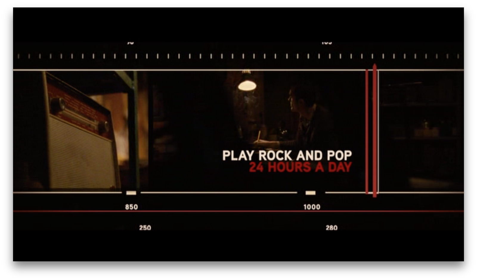
There are 14 titles although some of these titles are ones that tell a story. The animated graphic on screen is tuning a radio representing radio dial and the titles are in a strip going across the screen. Each title is positioned differently- this is to avoid dullness. Also the titles have more that one colour, white and red. Each title is transitioned with a wipe edit. This was to create verisimilitude as the film was set in 1966 and now to see a wipe edit being used. In the title "The Boat That Rocked" the words "boat" and "rocked" we're in upper case whereas the words "the" and "that's" we're in lower case and half the size.
Duration
The opening sequence is 00:03:15
Sound, Music
The opening sequence is 00:03:15
Sound, Music
On the working title company ident there is an audio bridge starts. The sound is diegetic because the it is coming out a radio. The music ends when the last title comes on before the 1st shot.
Shot Variety
At the start the shots are fairly short. A shot reverse shot, shot revesrse shot them a cut away show has been used.
Intertextuality + Genre Signifiers
Narrative + Exposition
Mise-en-scene: Props, Location, Lighting
The mise-en-scene is a montage with lots of different clips. It is switching between the radio station on the boat and lots of locations around Britain of people listening to the radio live.


The key props that can be spotted is the microphone in the radio station and the radios that the people around Britain are listening to.
Transitioning to the main film
The opening of the film is separated from the main body of the film by the title which is conventional. The edited footage in the opening links to the audio nicely as he is waving his arms to the sound of the music.


Shot Variety
At the start the shots are fairly short. A shot reverse shot, shot revesrse shot them a cut away show has been used.
Intertextuality + Genre Signifiers
Narrative + Exposition
Mise-en-scene: Props, Location, Lighting
The mise-en-scene is a montage with lots of different clips. It is switching between the radio station on the boat and lots of locations around Britain of people listening to the radio live.


The key props that can be spotted is the microphone in the radio station and the radios that the people around Britain are listening to.
Transitioning to the main film
The opening of the film is separated from the main body of the film by the title which is conventional. The edited footage in the opening links to the audio nicely as he is waving his arms to the sound of the music.




Four Lions Opening Analysis
(Chris Morris, 2010)
Produced by Warp Films, (+ Film4; Wild Bunch, Optimum Releasing)
Budget: £2.5 million
 |
| The film opens with the company ident for Wild Bunch (10 seconds in length.) As "Wild Bunch" is a German Film Distribution Company, we understand this company ident to mean that they were the distributors for "Four Lions" |
 |
| "Film4" is a production company, so this company ident (10 seconds in length) reveals to us that they produced "Four Lions". Both company idents keep their original sound. |
 |
| This is the first shot of the film. There are no titles - it simply cuts in with a static medium-long shot (that shifts ever so slightly) of one of the characters in the middle third. All the sound is diegetic. It can be denoted that the character looks middle-eastern, is wearing dark, khaki clothing, and a head band with what appears to be islamic writing on it: this exposition shows us that the character is islamic, and given that the audience is likely to have seen videos of terrorist propaganda on the news (intertextuality) we understand that this character is meant to be a terrorist. A narrative enigma is created briefly as an audience wonders what he is going to say and what's going to happen next. The lack of titles seems to have been done to create a strong sense of verisimilitude (as if this were really a terrorist demands video, as that wouldn't have titles.) |
 |
| In the next shot (cuts to a long shot - which is important as it increases the shot variety) the rest of the main characters are revealed, and it becomes clear to the audience that they are not actually a serious terrorist group, but just four Pakistani's from Sheffield, West Yorkshire (exposed through their accents.) However, there is a slight narrative enigma as we (the audience) are left wondering what they're trying to achieve by being terrorists. We can denote that the room they are in is shabby and sparsely furnished, which has connotations of our main characters being lower-middle class. |
 |
| However, there is a jump-cut to a medium shot of Omar's (the protagonist's) family, but now the room in which they are in is a lot cleaner and nicer, a direct contrast to the place in which we first met Omar. This creates a binary opposition; the terrorist, and the family man. It must be denoted that his wife is a nurse, and that he has a young son; these two facts both make the audience more connected to Omar, despite his attempts to be a terrorist. All sound up until this point has been diegetic, but non-diegetic music begins to fade in (providing an audio bridge.) |
 |
| This is the 1st title to appear in the film, however it doesn't appear until 3:01. The word "presents" shows us that Film4 produced this film. Non-diegetic music (which sounds middle eastern and quite serious) has begun to play by this point. This footage provides the transition (with the aid of an audio bridge) from the introduction to the main film, and also gives anchorage to help with the context (e.g. that it takes place within a city.) |
 |
| This is the (2nd and) main title (the name) of the movie. It's written in sans-serif and is easy to read; fonts like this are commonly used in comedies and dramas ("Four Lions" being a combination of the two.) It's small, and in the lower middle third of the screen, however as the camera zooms in on the Mosque with fairy lights (center, middle third) we understand that this movie is to focus on Islam; the mosque is being used as anchorage. As we've seen the four Jihadi terrorists by this point, we understand the title "Four Lions" is a direct reference to them. |
 |
| Just as with the 1st and 2nd titles, the writing here is small, sans-serif style and pale coloured, meaning it is not eye-catching. Again it's also in the bottom two thirds, almost as if it was not meant to be seen (or at least focused on.) This title mentions the production company (Warp Films) and the director (Chris Morris - who is only mentioned once within the titles; this is unusual, as normally the director is mentioned twice.) The mise-en-scene here depicts an empty shopping center, which is revealed to be the place of employment of Omar. The use of the empty shopping center is to anchor the fact that Omar lives in the western world, which makes his involvement in a Jihadi terrorist group all the more confusing for the audience. |
 |
| This is the final title for the opening, and it simply names two companies involved in the majority of distribution of this film; Wild Bunch and Optimum Releasing. Again, the writing is small and difficult to read, especially as it's placed in the bottom third. (The non-diegetic music ends here.) *Each title lasts approximately 5 seconds (and they fade in/out,) with the overall title sequence stretching from 3:01 to 3:20.
(Main) Props List
Location
|
Subscribe to:
Posts (Atom)